
First, I recommend that you download and install this font:
Download the Atkinson Hyperlegible Font | Braille Institute
It is different from traditional typography design is that it focuses on letterform distinction to increase character recognition, ultimately improving readability. The Braille Institute are making it free for anyone to use.
Second, update your browser setting to use the font for web pages.
In Firefox, the settings look similar to this:
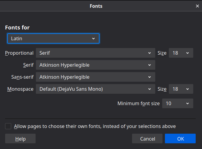
Notice that you have to uncheck the option (near bottom of the dialog) to "Allow pages to use their own fonts instead" if you wish to force the use of your font choice everywhere.
In Chrome, the settings look similar to this:
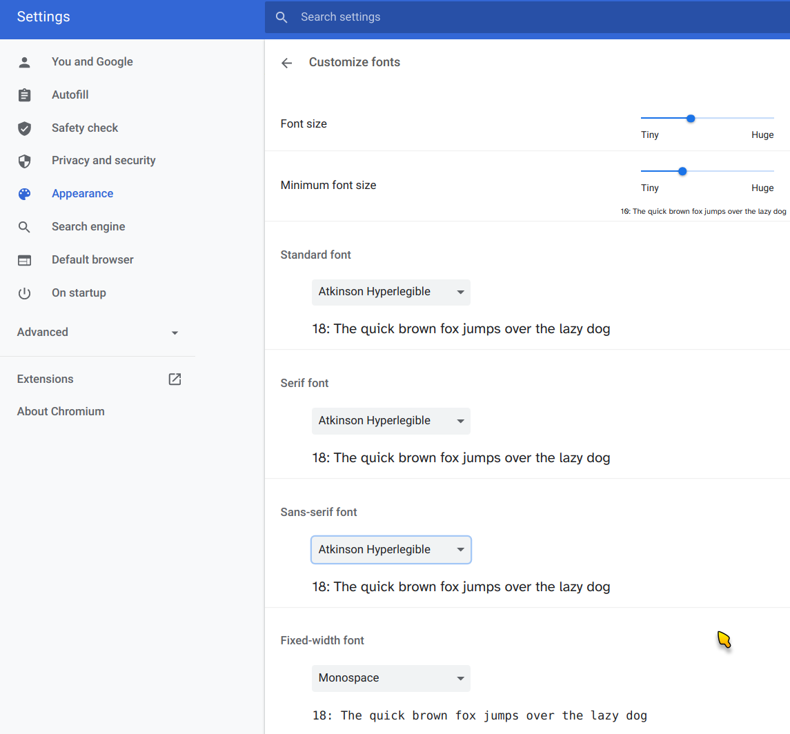
Don't use Atkinson Hyperlegible Font for monospace, but (as you can see) I am using it for all other font families.
Also note that Ask FitEyes includes an option at the top of the page to increase the font size.